


Basic functionality
- on hover we should show how it will look after the rating is given.
- we should expose an onRate function to handle a given rating.
- component's user should be able to over-ride the styles with ease
Let's us start
Now first of all lets think how a user of this component is going to consume this component i.e API driven development.
const options = {
  dataId: "star-rating",
  noOfStar: 10, // or may be 5
  initialValue: 0,
  onRate: (rating, e) => console.log({ rating }),
};
const starComponent = new StarRating(options);

```
// In html somewhere provide that dataId to some wrapper

<div data-rator="1"></div>

```;
Techincal breakdown
It is a great thing to write down everything your are going to do in code before writing code. Though in an interview you should just explain how you are going to do it.
Lets do a technical breakdown of how we are going to handle this.
- grab the wrapper, if not found throw error.
const wrapper = document.querySelector(`[data-rator="${dataId}"]`);

if (!wrapper) {
  throw new Error("a wrapper with given dataId not found");
}
- we create stars equal to the given number and append them to the wrapper, then to each star we provide a low CSS specificity selector i.e data attribute to apply some base style.
const createStar = ({ val, wrapperId, onRate, onMouseOver }) => {
  const star = document.createElement("span");
  star.setAttribute("data-star", `${wrapperId}_${val}`);
  star.textContent = "\u2606"; // a  hollow star unicode
  star.addEventListener("click", onRate);
  star.addEventListener("mouseover", onMouseOver);
  return star;
};
- append stars to wrapper element.
for (let i = 1; i <= noOfStars; i++) {
  wrapper.appendChild(
    createStar({
      val: i,
      wrapperId: dataId,
      onRate: handleOnRate,
      onMouseOver: handleMouseOver,
    })
  );
}
we add some event handlers
click- simply to get user rating
const handleOnRate = ({ target }) => { const val = getStarVal(target); this.rating = val; onRate(val); };mouseover- to highlight all-stars up to current, we will add anactiveclass to all-stars to its left including itself and will remove the active class from all of its right
const handleMouseOver = ({ target }) => { // handles the above functionality highlightStarsUptoCurrent(getStarVal(target), dataId, noOfStars); };mouseout- probably, maybe we can setmouseouton the just wrapper and remove allactiveclasses.
// on wrapper

const handleMouseOut = () => {
  highlightStarsUptoCurrent(this.rating, dataId, noOfStars);
};
I think that's all.
wait, where is CSS. Here is a little bit of CSS we need.
[data-star] {
  position: relative;
  font-size: 60px;
  display: inline-block;
}
[data-star].active::before {
  /* solid star unicode */
  content: "\2605";
  position: absolute;
  color: orange;
}
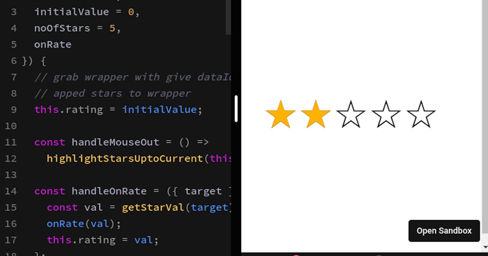
Woah... below is the working demo.
There is a very neat trick to handle the functionality of showing filled stars on hover using pure CSS that you can check here.
You can check the complete code here.
Please like and share if like you it.